A crucial moment in the life of a new play or musical is the moment it goes from being just a title to having title or key art. Key art may change dramatically over the life of a play, but just having a visual identity for the property is as essential as having a logo for a new business. Here's a look at some of my process for the creation of key art for Hay Fever: A New Musical.
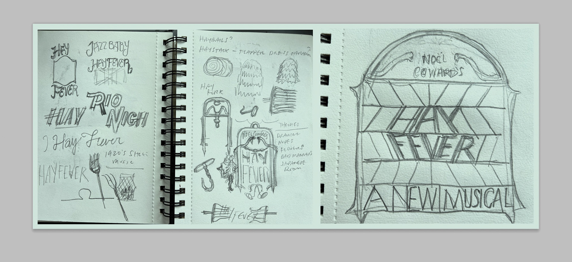
Every design starts with a sketch. I do them quickly; its a visual way of conceptually metabolizing the task at hand. I'm looking for something grounded in the world of the play and to leave my preconceptions behind.
It's essential to convey the tone of the play but it is almost impossible to visually embody abstract ideas like "wit," "whimsy," or "humor,"-- focusing on plot elements like "romance" can become active visuals.
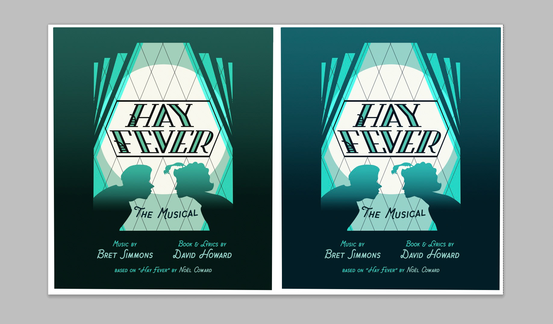
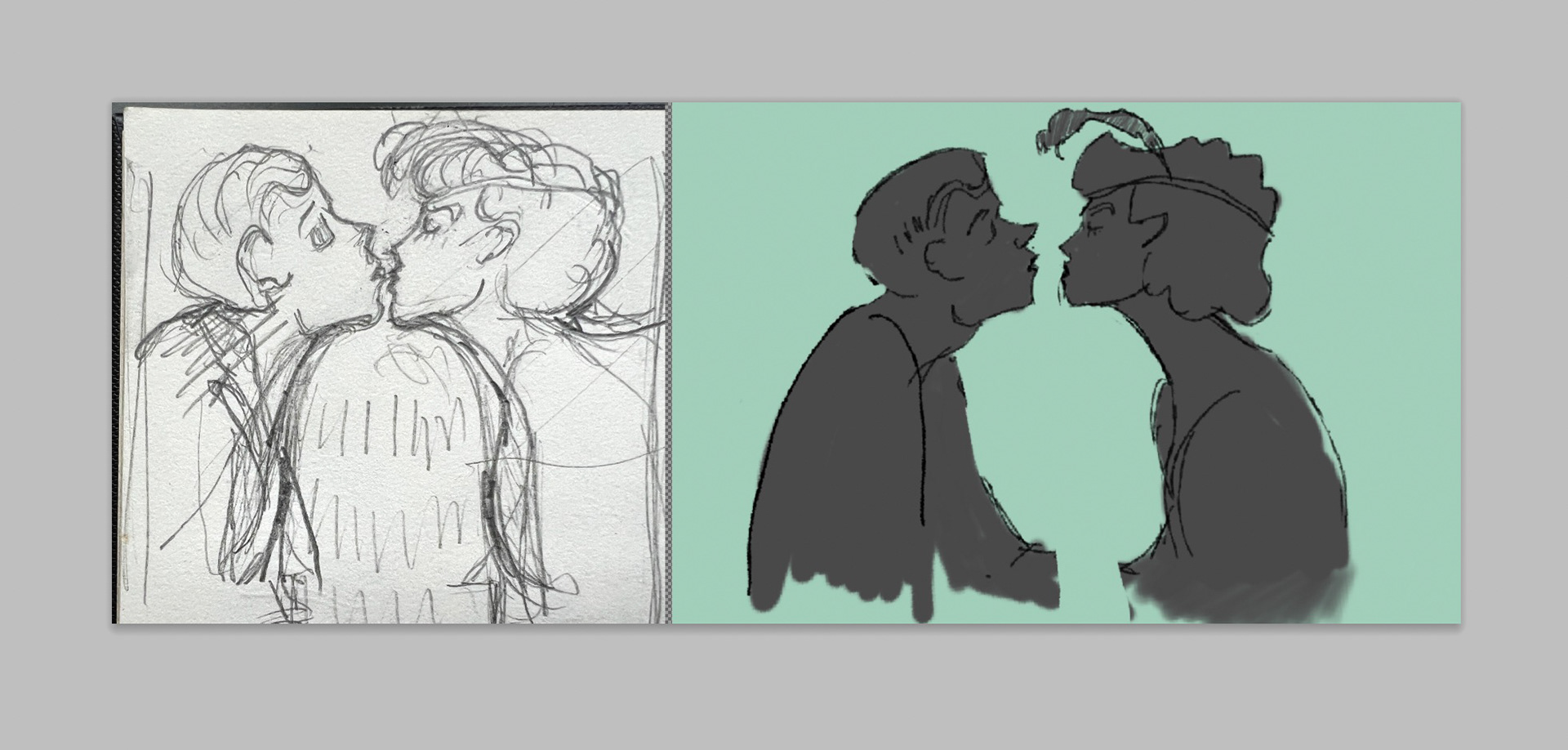
Color is always essential to mood but it's also got to be replicated consistently across different media types. Here, at left a more CMYK friendly version of the moonlit colorway at right. Notice also that the relationships of the silhouettes have become slightly ambiguous; do they love each other or hate each other? In this case, the ambiguity is relevant to the story.
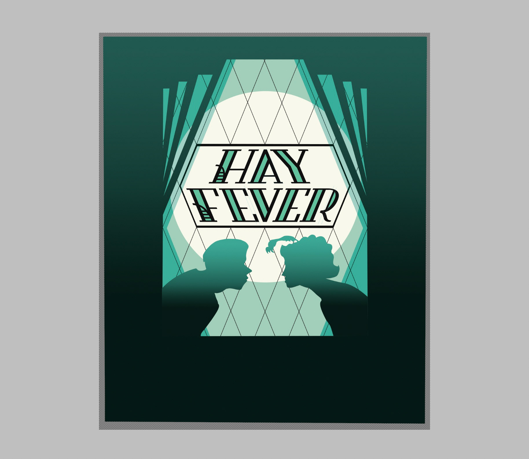
Here's the final lockup for Hay Fever, sans authors credits. While the relationship between the characters is subjective the monochromatic title treatment and art deco window suggests period, setting, and mood.
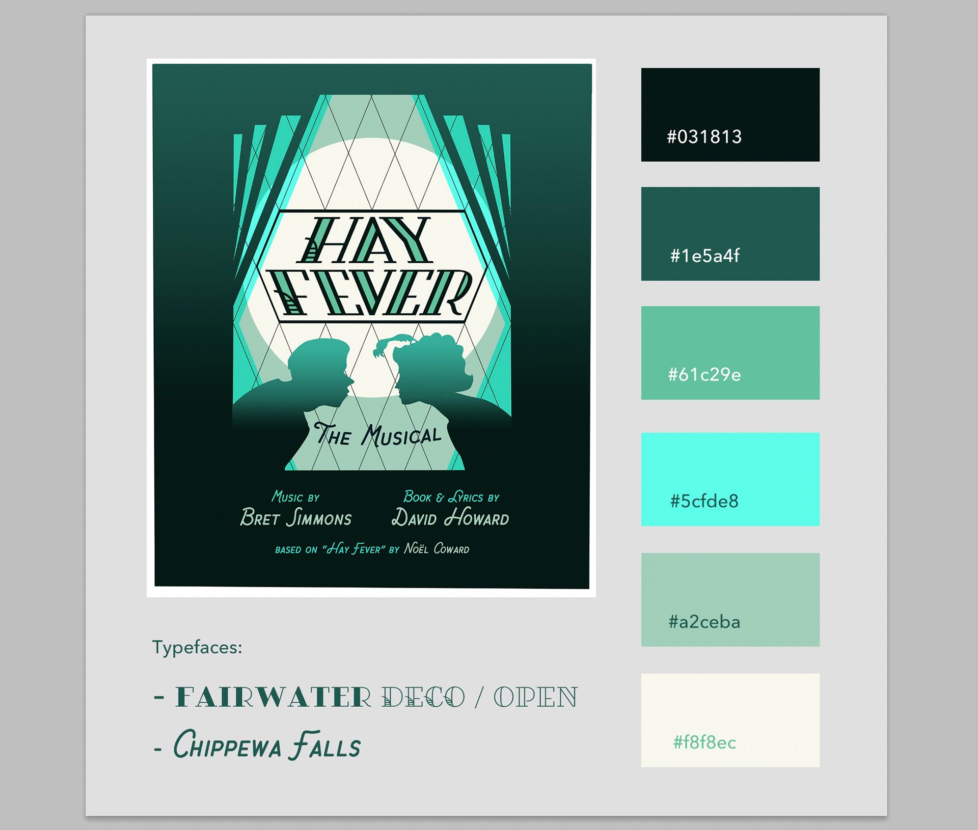
The final style sheet for Hay Fever, shown here with the author's credits. I like to note typefaces, and key colors for other designers as a time-saving step for the future.